Build an Accessible React Date Input Component with Internationalization and Reusability
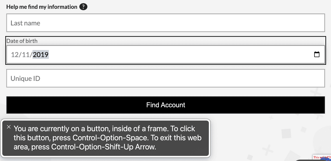
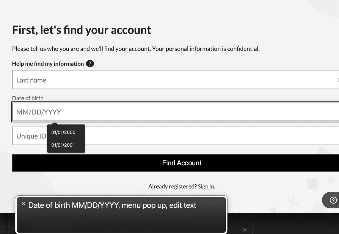
Working with dates and date inputs for production applications can be tricky once you realize that you’re going to have to roll your own if you want to have control over internationalization (abbreviated as i18n for short) and if you want it to be fully accessible. If you’ve ever tried using the built-in HTML date input, you know that it’s not accessible. Another problem you’ll run into is that the internationalization is spotty and is not going to be 100% consistent across browsers either. In the image below, you can see that the voiceover assistant has no concept of the input as changes are made within it. This means that sight-challenged users will be unable to fill out the form.

If you’re like me, your next logical step after coming to this conclsuion would be to take a look at what packages are already available to deal with this. Surprisingly, at the time of this writing there really isn’t anything for just a simple date input that is going to give you 100% accessibility, let alone full i18n control. There are a few libraries like AirBnB’sreact-dates that will give you the kind of accessibility that one should expect from a production web application along with formatting control for i18n, but these are huge libraries that are largely centered around providing complex date and date range pickers. Date pickers certainly have their place, but if all you want is a simple date input for say - entering the user’s birth date, do you really want to be adding a big library to your package.json? Probably not. This means you’ll have to build your own. Luckily, I’m about to show you how you can easily do this.
High Level Overview
Before we start building, let’s create a strategy for how this component will come together. Here is a breakdown for how we will accomplish the goal of creating a fully accessible date input with built-in validation, internationalization and reusability with a minimal footprint:
- Validation: we will use react-imask to provide the formatting mask and built-in day/month/year limits for the input.
- Accessibility: we will use props to pass in the necessary ARIA attributes and labels for the component.
- Reusability: the component should also support abbreviated formats such as mm/dd or dd/mm and mm/yyyy or yyyy/mm
- Internationalization: we will create a few utility functions that will allow the date to be formatted and parsed correctly for the current locale.
Base IMaskInput Component Setup
The first thing we need to do is setup the component with react-imask’s IMaskInput and create the formatting mask for the date input with blocks. These blocks will format the date and limit the entry of month, day and year. Using a mask on the input along with blocks that are limited with min and max values, we do not need to include regex pattern validation, which would be a bit of a pain to implement since it would have to account for each format including abbreviated formats.
import React, {useState} from 'react';
import {IMaskInput, IMask} from 'react-imask';

type TDateInputProps = {
  onChange: (value: string) => void;
  language?: string;
  ariaLabel?: string;
  className?: string;
  placeholder?: string;
  id?: string;
  name?: string;
  defaultValue?: string;
  disabled?: boolean;
  ariaInvalid?: boolean;
};

function DateInput({
  onChange,
  ariaLabel,
  placeholder,
  className,
  name,
  id,
  defaultValue,
  disabled = false,
  ariaInvalid = false,
}: TDateInputProps) {
  const [dateValue, setDateValue] = useState<string>(defaultValue?.toString() || '');

  const handleAccept = (value: string) => {
    setDateValue(value);
    onChange(value);
  };

  const blocks = {
    // day block with mask set to MaskedRange from 1 to 31 with a length of 2
    d: {
      mask: IMask.MaskedRange,
      from: 1,
      to: 31,
      maxLength: 2,
    },
    // month block with mask set to MaskedRange from 1 to 12 with a length of 2
    m: {
      mask: IMask.MaskedRange,
      from: 1,
      to: 12,
      maxLength: 2,
    },
    // year block with mask set to MaskedRange from 1900 to 2999 with a length of 4
    Y: {
      mask: IMask.MaskedRange,
      from: 1900,
      to: 2999,
    },
  };

  return (
    <IMaskInput
      id={id}
      mask={'m{/}`d{/}`Y'}
      disabled={disabled}
      blocks={blocks}
      name={name}
      aria-label={ariaLabel}
      aria-invalid={ariaInvalid}
      placeholder={placeholder}
      className={className}
      onAccept={handleAccept}
      value={dateValue}
    />
  );
}

export default DateInput;
Note that the
IMaskInputusesonAcceptto handle change events.
Now let’s add some reusability elements. We’re going to add a couple of props called showDay and showYear. This will allow for the component to be reused for scenarios where only the day and month or month and year are needed. We’ll dynamically set the mask on the IMaskInput with useEffect based on the value of these props.
import React, {useState, useEffect} from 'react';
import {IMaskInput, IMask} from 'react-imask';

type TDateInputProps = {
  onChange: (value: string) => void;
  ariaLabel?: string;
  className?: string;
  placeholder?: string;
  id?: string;
  name?: string;
  defaultValue?: string;
  disabled?: boolean;
  ariaInvalid?: boolean;
  showDay?: boolean;
  showYear?: boolean;
};

function DateInput({
  onChange,
  ariaLabel,
  placeholder,
  className,
  name,
  id,
  showDay = true,
  showYear = true,
  defaultValue,
  disabled = false,
  ariaInvalid = false,
}: TDateInputProps) {
  const [dateValue, setDateValue] = useState<string>(defaultValue?.toString() || '');
  const [maskPattern, setMaskPattern] = useState<string>('');

  const handleAccept = (value: string) => {
    setDateValue(value);
    onChange(value);
  };

  const blocks = {
    d: {
      mask: IMask.MaskedRange,
      from: 1,
      to: 31,
      maxLength: 2,
    },
    m: {
      mask: IMask.MaskedRange,
      from: 1,
      to: 12,
      maxLength: 2,
    },
    Y: {
      mask: IMask.MaskedRange,
      from: 1900,
      to: 2999,
    },
  };

  useEffect(() => {
    let pattern = 'm';
    if (showDay) pattern += '{/}`d';
    if (showYear) pattern += '{/}`Y';
    setMaskPattern(pattern);
  }, [showDay, showYear]);

  return (
    <IMaskInput
      id={id}
      mask={maskPattern}
      disabled={disabled}
      blocks={blocks}
      name={name}
      aria-label={ariaLabel}
      aria-invalid={ariaInvalid}
      placeholder={placeholder}
      className={className}
      onAccept={handleAccept}
      value={dateValue}
    />
  );
}

export default DateInput;
Accessibility
The aria-label and aria-invalid props are used for accessibility. These get passed through to the underlying text input of the IMaskInput. The aria-label tells screen readers what to say when the user enters into the input by either tabbing or clicking on it, and the aria-invalid is used to indicate that the input is invalid. The aria-invalid prop is set to true when validation fails, such as when the form is submitted while the input is empty.
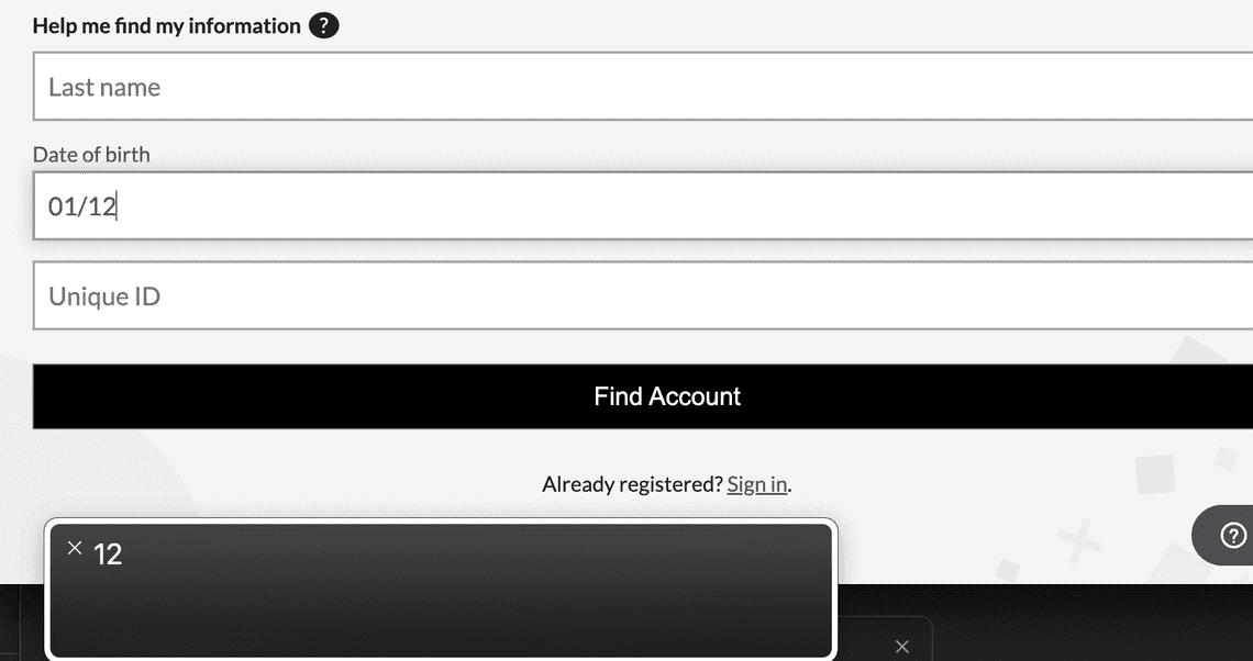
Since this component is simply a text input, the screen reader has no problem recognizing the accessibility attributes and reading the correct numbers as they are entered into the field.


Setting up Internationalization
In order to use the component in a multi-language environment, we’ll need to first set up the following utility functions:
- A simple function for getting the language from the browser
- A function to retrieving the format based on the language
- A function to reformat the date when the form is submitted
The first function is super simple. It simply retrieves the language prop from the window’s navigator object:
export const getBrowserLanguage = (nav = navigator) => {
  return (nav && nav.language) || 'en';
};
The second function is also pretty straight-forward. It accepts the language code and returns the format for that language.
export function getDateFormatFromLanguage(language: string) {

  let code = '';
 if (language === 'en-GB' || 'en-NZ' || 'en-IE' || 'en-ZA' || 'en-AU')  {
    return 'dd/mm/yyyy';
  } else {
     code = language.substring(0, 2);
  }

  switch (code) {
    case 'ar':
    case 'da':
    case 'de':
    case 'es':
    case 'fr':
    case 'hi':
    case 'id':
    case 'it':
    case 'nb':
    case 'nl':
    case 'pl':
    case 'pt':
    case 'ro':
    case 'sv':
      return 'DD/MM/YYYY';
    case 'ja':
    case 'ko':
    case 'zh':
      return 'YYYY/MM/DD';
    default:
      return 'MM/DD/YYYY';
  }
}
Taking the substring of the first two letters is important for cross-browser compatibility and handling scenarios where we have four-character language codes that aren’t included in the switch. Take the Korean language for example. Setting the default language to Korean in Chrome results in the code 'ko', but in Firefox and Safari, the getBrowserLanguage function returns 'ko-KR'. Yet, you won’t find ko-KR listed in the ISO language codes. This makes things a little unpredictable for trying to anticipate what will be returned for the browser language. So to be on the safe side, I am stripping off the second set of characters. However, this presents a new problem for handling the English language though, since english-speaking countries besides the US (en-US) and Canada (en-CA) use dd/mm/yyyy for date formats. This is why the if statement first checks for full ISO language codes for english that is not US or CA. A more complete approach to this might be to create an object map of all 128 or so ISO language codes and their respective date formats.
The third utility function is a bit more complicated. This function is for reformatting the date as YYYY-MM-DD, which is the standard ISO format that most APIs expect. It accepts the date string and the language code and returns the reformatted date.
import {getDateFormatFromLanguage} from './getDateFormatFromLanguage';

export function reformatStringDateToISO(dateString: string, language: string): string {
  let isoDate = '';
  const dateFormat = getDateFormatFromLanguage(language);

  if (dateFormat === 'MM/DD/YYYY') {
    const split = dateString.split('/');
    isoDate = `${split[2]}-${split[0]}-${split[1]}`;
  } else if (dateFormat === 'YYYY/MM/DD') {
    isoDate = dateString.replace(/\//g, '-');
  } else if (dateFormat === 'DD/MM/YYYY') {
    const split = dateString.split('/');
    isoDate = `${split[2]}-${split[1]}-${split[0]}`;
  }

  if (isoDate === '') {
    throw new Error(`Invalid date format: ${dateFormat}`);
  } else {
    return isoDate;
  }
}
Now with our utility functions in place, we can complete DateInput component. We’ll add a language prop to the component and pass it through to the getDateFormatFromLanguage function. We’ll also add two new state variables for format and the default placeholder. We’ll use two useEffect hooks, where the first sets the format from getDateFormatFromLanguage, and the second will use a switch statement to set the input mask and placeholder based on that format.
import React, {useState, useEffect} from 'react';
import {IMaskInput, IMask} from 'react-imask';
import {useStrings} from 'ux-cms';
import {getDateFormatFromLanguage} from 'ux-utilities';

type TDateInputProps = {
  onChange: (value: string) => void;
  language?: string;
  ariaLabel?: string;
  className?: string;
  placeholder?: string;
  id?: string;
  name?: string;
  defaultValue?: string;
  disabled?: boolean;
  ariaInvalid?: boolean;
  showDay?: boolean;
  showYear?: boolean;
};

function DateInput({
  onChange,
  language = 'en',
  ariaLabel,
  className,
  placeholder,
  name,
  id,
  showDay = true,
  showYear = true,
  defaultValue,
  disabled = false,
  ariaInvalid = false,
}: TDateInputProps) {
  const [dateValue, setDateValue] = useState<string>(defaultValue?.toString() || '');
  const [maskPattern, setMaskPattern] = useState<string>('');
  const [format, setFormat] = useState<string>('');
  const [defaultPlaceholder, setDefaultPlaceholder] = useState<string>('');

  const strings = useStrings();

  const handleAccept = (value: string) => {
    setDateValue(value);
    onChange(value);
  };

  const blocks = {
    d: {
      mask: IMask.MaskedRange,
      from: 1,
      to: 31,
      maxLength: 2,
    },
    m: {
      mask: IMask.MaskedRange,
      from: 1,
      to: 12,
      maxLength: 2,
    },
    Y: {
      mask: IMask.MaskedRange,
      from: 1900,
      to: 2999,
    },
  };

  useEffect(() => {
    const dateFormat = getDateFormatFromLanguage(language);
    setFormat(dateFormat);
  }, [language]);

  useEffect(() => {
    if (format) {
      let pattern = '';
      switch (format) {
        case 'MM/DD/YYYY':
          pattern = 'm';
          if (showDay) pattern += '{/}`d';
          if (showYear) pattern += '{/}`Y';
          setMaskPattern(pattern);
          setDefaultPlaceholder(strings.FormInput_Date_MMDDYYYY);
          break;
        case 'DD/MM/YYYY':
          if (showDay) {
            pattern = 'd';
            pattern += '{/}`m';
            if (showYear) pattern += '{/}`Y';
          } else {
            pattern = 'm';
            pattern += '{/}`Y';
          }
          setMaskPattern(pattern);
          setDefaultPlaceholder(strings.FormInput_Date_DDMMYYYY);
          break;
        case 'YYYY/MM/DD':
          if (showYear) {
            pattern = 'Y';
            pattern += '{/}`m';
            if (showDay) pattern += '{/}`d';
          } else {
            pattern = 'm';
            pattern += '{/}`d';
          }
          setMaskPattern(pattern);
          setDefaultPlaceholder(strings.FormInput_Date_YYYYMMDD);
          break;
        default:
          pattern = 'm';
          if (showDay) pattern += '{/}`d';
          if (showYear) pattern += '{/}`Y';
          setMaskPattern(pattern);
          setDefaultPlaceholder(strings.FormInput_Date_MMDDYYYY);
          break;
      }
    }
  }, [
    showDay,
    showYear,
    format,
    strings.FormInput_Date_DDMMYYYY,
    strings.FormInput_Date_MMDDYYYY,
    strings.FormInput_Date_YYYYMMDD,
  ]);

  return (
    <IMaskInput
      id={id}
      mask={maskPattern}
      disabled={disabled}
      blocks={blocks}
      name={name}
      aria-label={ariaLabel}
      aria-invalid={ariaInvalid}
      placeholder={placeholder ? placeholder : defaultPlaceholder}
      className={className}
      onAccept={handleAccept}
      value={dateValue}
    />
  );
}

export default DateInput;
It is worth noting that the translations for the placeholders are handled by a custom CMS package where translations are handled through a third party, but a library like react-i18next should work just as well.

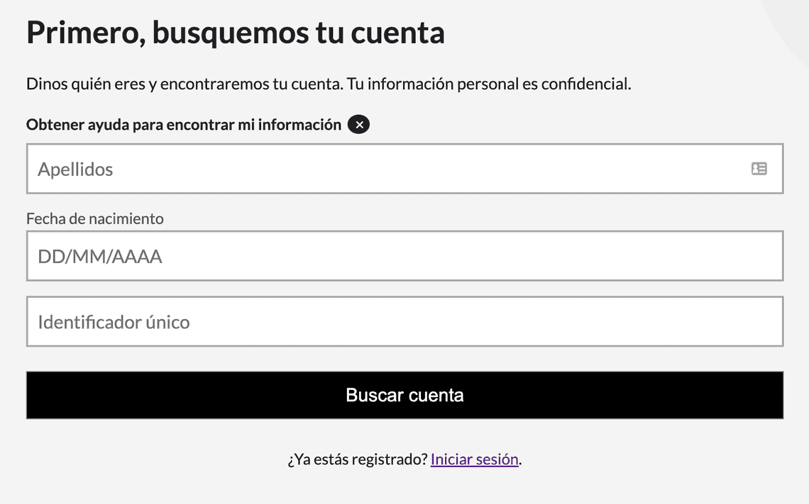
For the sake of brevity, let’s look at how you would implement this component using react-hook-form. I would rather show an implementation like this because I feel like it provides more of a “real world” example of how you might use it and I want to show how the aria-invalid attribute is used. Note that this is the code for the implementation seen in the image above:
import React from 'react';
import {useFormContext, Controller} from 'react-hook-form';
import styles from './styles.css';
import {useStrings} from 'ux-cms';
import {DateInput} from '../DateInput';
import {getBrowserLanguage} from 'ux-utilities';

function BirthDateInput() {
  const strings = useStrings();
  const {
    register,
    control,
    formState: {errors},
  } = useFormContext();

  return (
    <div className={styles.inputWrapper}>
      <label className={styles.inputLabel} htmlFor="birthDate">
        {strings.FormInput_BirthDate_Label}
      </label>
      <Controller
        name="birthDate"
        rules={{
          required: strings.FormInput_BirthDate_ValidationFailure_Required, // {1}
        }}
        render={({field}) => (
          <DateInput
            id="birthDate"
            disabled={isDisabled}
            className={errors.birthDate?.message ? styles.lookupInputError : styles.lookupInput} // {2}
            onChange={(value: string) => {
              field.onChange(value);  // {3}
            }}
            ariaLabel={strings.FormInput_birthDate_Label}
            ariaInvalid={errors.birthDate ? true : false} // {4}
            language={getBrowserLanguage()} // {5}
          />
        )}
        control={control}
      />
      {errors.birthDate && (  // {6}
        <span role="alert" className={styles.validationErrorMessage}>
          {errors.birthDate.message}
        </span>
      )}
    </div>
  );
}
export default BirthDateInput;
The specifics around react-hook-form are beyond the scope of this article, but you can read my article on advanced form development with React Hook Form to get a clearer picture for how it is being used here. There are a few things to note, which I have labeled in the code with corresponding numbers:
- The required validation rule is added to the form control. When this validation fails, it automatically sets the
ariaInvalidattribute totrue. - If a validation error message is being displayed, set the style accordingly.
- The
onChangecallback is used to update the value of the form control. This is triggered when theonAcceptevent on the IMaskInput is fired. - The
ariaInvalidattribute is used to indicate whether the form control is in an invalid state based on whether or noterrors.birthDateis defined. - The language property is set by making the call to our
getBrowserLanguageutility function. - The
errors.birthDateis used to determine whether or not to display the validation error message.
Then in form container that contains the date input, you would make the call to reformatStringDateToISO in the submit handler:
const onSubmit = (data: TFormValues) => {
  const isoDate = reformatStringDateToISO(data.birthDate, language);
  // replace the value for birthDate with the ISO reformatted date
  const updatedFormValues = {...data, birthDate: isoDate};
  onFormSubmit(updatedData);
}
There you have it! We now have a fully functional production-ready DateInput component that is fully accessible, reusable, and localized. You can find the source code for this component in this Github repo, including unit tests.

